Want Your Product to Look More Premium? Try a Darker Color
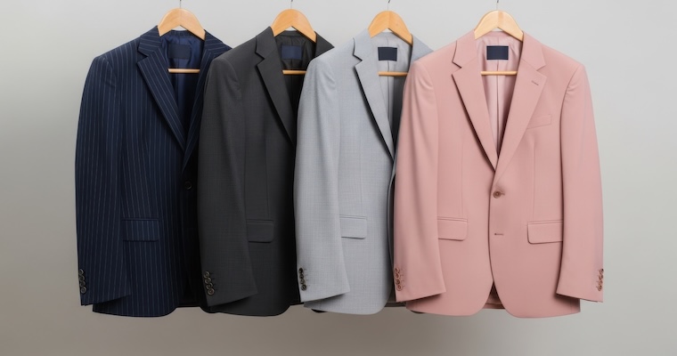
Entrepreneurs may not need costly materials or features to create a premium image. New research shows darker colors can signal status and prestige.
When entrepreneurs develop a new product, the natural instinct is often to focus on what they can add: better materials, more features, elaborate packaging, craftsmanship, limited editions, or other elements that make the product feel more premium. Those strategies can work, but they can also be expensive. For a startup or growing business, every additional feature or production upgrade has to compete for limited resources.
We became interested in a different question: Can entrepreneurs create some of that premium, high-status perception through design choices that cost little or nothing extra?
We focused on one particularly simple choice: color darkness. Choosing a darker rather than a lighter shade often adds little or no extra production cost. Yet darker colors are commonly associated with qualities such as power, dominance, competence, and strength, which are closely connected with status.
Our broader interest was not simply whether a darker product looks more prestigious. We wanted to understand whether color darkness could become a useful product-development tool: something businesses could use early, before committing to more expensive product changes. That also meant understanding when the cue works, when it does not, and how communication can change its effectiveness.
When do darker colors signal higher status?
Previous research already suggested that darker colors can be associated with power and status. What was less clear was whether those associations would actually affect how consumers evaluate and choose products.
We expected that not everyone would automatically prefer darker products. Instead, we thought the effect would depend on whether status mattered to the customer. Some consumers are generally more interested in products that help them signal prestige or social standing. In other cases, the same consumer may become more status-conscious because of the situation -- for example, when attending an important professional or social event.
We also suspected that the way the design cue was presented would matter. Consumers often respond to visual cues without carefully analyzing them. If a company explicitly tells customers to focus on the darkness of a product, that may change the way they process the cue.
So, our goal was to understand not only whether darkness can influence product perceptions, but also how entrepreneurs can use that information when developing and testing new products.
What We Studied
Across six studies and a follow-up involving a total of 2,048 participants, we captured when status mattered to consumers in three different ways.
First, we measured how strongly people generally seek status through the products they buy. Second, we looked at past behavior, such as whether consumers had previously purchased expensive fashion products. Third, we created situations in which status was more or less important: for example, asking people to imagine choosing a product for a setting where they wanted to project status versus one where appearing approachable mattered more.
To capture product preferences, participants saw products that were similar except for the darkness of their color. They chose between lighter and darker versions, and we examined whether the darker version was perceived as higher status and whether it was more likely to be preferred or chosen.
We tested a range of products, including pens, water bottles, blazers, handbags, hats, and scarves, using both physical products and digital product images.
Finally, we examined how the color cue was communicated. In some studies, we explicitly drew attention to how dark the product was. In others, we allowed people to respond without highlighting the color difference. We also tested what happened when people were busy and had less attention available to think carefully about the cue.
What We Found
Our first finding was that darker products can be perceived as higher status, but the effect is not universal. It activates when status matters to the customer. People who are generally more interested in signalling status are more likely to perceive darker products as prestigious and, as a result, are more likely to prefer or choose them.
The same customer may also respond differently in other situations. In one of our studies, consumers imagined buying a designer blazer. When the scenario emphasized projecting status in a hierarchical organization, consumers preferred the darker blazer and perceived it as conveying more status. When the goal was to appear approachable in an egalitarian organization, darkness provided no advantage.
We saw a similar pattern when we looked at past behavior. Consumers with a history of buying expensive fashion products were more likely to prefer a darker product over an otherwise identical lighter one.
One of the most surprising findings concerned communication. When we explicitly drew consumers’ attention to how dark the product was, the effect became weaker. However, when consumers were busy and had less attention available to think carefully about the cue, the darker-product advantage reappeared.
This suggests that consumers may associate darkness with status relatively intuitively. For product developers, that matters because a visual cue can influence perceived value even when it does not change the product’s objective quality or production cost.
The Takeaway: Low-cost design choices can create symbolic value
One of the most useful lessons is that product development does not always have to begin with the question, “What can we add?” Entrepreneurs can also ask: “What can we change?”
Traditional status signals such as premium materials, craftsmanship, scarcity, exclusivity, and sophisticated packaging can still be very effective. Our research does not suggest replacing them. Instead, it shows that simple visual decisions can complement those investments.
Color darkness is one example. For businesses with limited resources, having a darker version of a product may offer a relatively inexpensive way to increase perceptions of status before making more costly changes.
The second lesson is that product development should not happen in isolation from customer understanding. A darker design is not automatically better. The effect depends on whether status matters to the customer and whether it matters in the buying situation.
A product designed for customers who want to project prestige, success, competence, or power may benefit more from a darker design than one aimed primarily at customers seeking accessibility or approachability.
The third lesson is that entrepreneurs should think carefully about how much they explain a design choice. If a visual cue is already communicating prestige effectively, drawing too much attention to it may reduce its impact. Sometimes the better decision is to allow the design to communicate on its own.
Test Small Design Changes Before Making Big Investments
Based on our research, we recommend that entrepreneurs bring low-cost visual experimentation into the product-development process earlier. Before committing to a final design, entrepreneurs can create different versions of the same product and test them with potential customers.
- Test the perception, not just the look. Compare lighter and darker versions of the product, alternative packaging shades, different finishes, or different online product images. The goal is not simply to ask which version looks better, but whether one version creates the intended perception.
- Test the design against the image customers want to project. If customers want to project status, prestige, or power, examine whether a darker design strengthens those perceptions. If they instead want to convey qualities such as approachability, accessibility, or friendliness, test whether a lighter design better supports that positioning. Previous research suggests that lighter colors can generate favorable associations in some contexts, although our studies did not directly test these particular perceptions.
- Start with simple experiments. Businesses can use digital mock-ups, prototype images, concept tests, or online comparisons before investing in final materials, packaging, or large production runs.
- Use visual cues alongside other product decisions. Premium materials, craftsmanship, and packaging may still matter. Color darkness is not a substitute for these elements, but another lever that may be much cheaper to test.
- Think about symbolic as well as functional value. Consumers can attach greater value to a product even when its objective quality or production cost hasn’t changed. Product development should therefore consider not only what a product does, but also what it says about the person who owns or uses it.
For resource-constrained businesses, the broader opportunity is clear: Before assuming that a more premium product must also be more expensive to develop, experiment with the visual choices you already control. Sometimes, a small change in design can create a meaningful change in perception.
Explore the Research
Status Without Cost: How Color Darkness Can Increase Preferences and Perceptions of Status. Journal of Business Research, January 2027
This research was partially funded by the Spanish Agencia Estatal de Investigación MCIN /AEI /https://doi.org/10.13039/501100011033 / FEDER, UE Grant No. PID2022-138729OA-I00.